Friday, November 7, 2014

Forest


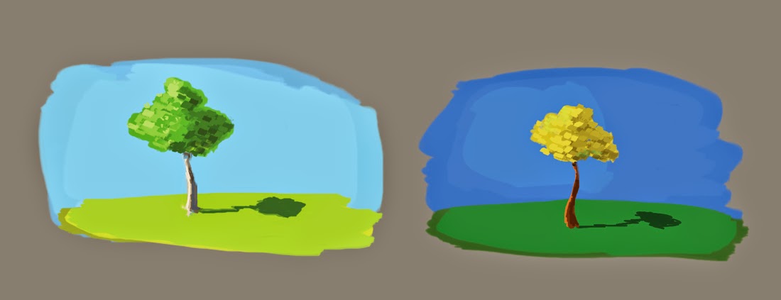
This was too ambitious. There was back lighting, atmosphere/fog, and early morning sun. 
It was too much to handle but I tried and it was fun-ish. I was trying to think what the early morning sun would actually do to these trees but obviously I started getting confused. I'll try something easier next time.  The trees in the background are too green, I think because of the bright sky it would be softer and brighter maybe more blue because it's being backlight but it's morning time. What is the sun doing to the foreground trees? And the midground trees? Thank you!!

Wednesday, November 5, 2014

Notes


Just wanted to get your opinion on these color choices. 
Thanks!

Tuesday, November 4, 2014

Push Over


Perspective is off. Trying to understand the notes from before about the color of the shadow and the sky. Hope I'm getting closer. 

Monday, November 3, 2014

Costumes


I realized that this wasn't the best ref image for color. It looks like the photo was saturated a bit. I wanted to try the blue sky color again so I changed the colors a bit. I hope it still stands up. I think the shadow sides could have gone darker more saturated. Thanks for the feedback. 

Wednesday, October 29, 2014

Snow House


I think I should have made the house smaller. The perspective seems off. 
And there should be a little bit more yellow/red on the shadow side of the house. 
Thanks for all your feedback!

Tuesday, October 28, 2014

Parrot


I thought that the Parrot was turning away from the light. So you'd only see the edges of the bird highlighted. I didn't have time to do details. It's pretty rough. Thanks for taking the time!

Monday, October 27, 2014

Walking Malcolm


I tried to streamline Malcolm's shape. I think there is more yellow in the sidewalk. 

Thursday, October 16, 2014

Potrero Hill


The buildings are feeling a little flat. I think it's because I haven't add more color detail. 
Also the perspective is off. More practice!

Wednesday, October 15, 2014

Presidio


Hey Goro, hope you're doing well! I'm trying to practice. Doing the best I can. Hope things are going well with you! Thank you for all your feedback. 

Monday, September 8, 2014

233


I took this picture outside of our apartment. 
There are definitely more blues in the actual picture. And the perspective isn't accurate. 
I think I can be a little bit more interpretive with the design as well.

Wednesday, September 3, 2014

Tree House


I used the ref for contrast and sky color. I know I was pushing it a bit with the color. They aren't exactly realistic. Thanks for your comments! 

Friday, August 29, 2014

House Hunting


I think the sky blue came out more saturated when I posted this. 
The grass shadows could be darker or more contrasting. Thanks for your notes!

Thursday, August 28, 2014

Crickets


I was just focusing on color. 
Not perspective, ha! I think the cricket shadow could be lighter and more yellow/green.
It seems too dark now. Thanks for all your input!! I know you're busy so no worries if you don't have time to comment. =) 


Monday, June 9, 2014

Red Car


The design of the car could def be better but
I tried to focus on the cool desaturated car colors in the shadow and the warm saturated car colors in the sunlight. The widow is missing reflections too. 

Thursday, June 5, 2014

Mail Box


I used the ref to influence the direction of light but the final painting is a little bit of a cheat. I think the there should be more shadow side on the front of the mail box. I tried to remember that the highlights get more saturated and warm in the sun light. I moved the highlights towards the greenish blue. Maybe it was too subtle?

Saturday, May 17, 2014

Fruits Part Duex


I used the same reference as the image below. I wanted to try the colors again.
I added the  bottle it was supposed to be metal not glass. This time I chose more shadow colors to fill in the fruits. I think the highlights could be punched up more though. 


(awesome revised painting by Goro Fujita)

Friday, May 9, 2014

fruits


I think the highlights could get more bright.
I skipped the metal cup altogether. Too many things to focus on. 

Wednesday, May 7, 2014

Grey Pug


I think the highlights aren't saturated enough. I could have made the local color more saturated. I tried to focus on the bringing the local color back into the table leg and the dog highlights.