Tuesday, November 18, 2014
Thursday, November 13, 2014
Wednesday, November 12, 2014
Friday, November 7, 2014
Forest
This was too ambitious. There was back lighting, atmosphere/fog, and early morning sun.
It was too much to handle but I tried and it was fun-ish. I was trying to think what the early morning sun would actually do to these trees but obviously I started getting confused. I'll try something easier next time. The trees in the background are too green, I think because of the bright sky it would be softer and brighter maybe more blue because it's being backlight but it's morning time. What is the sun doing to the foreground trees? And the midground trees? Thank you!!
Thursday, November 6, 2014
Wednesday, November 5, 2014
Tuesday, November 4, 2014
Push Over
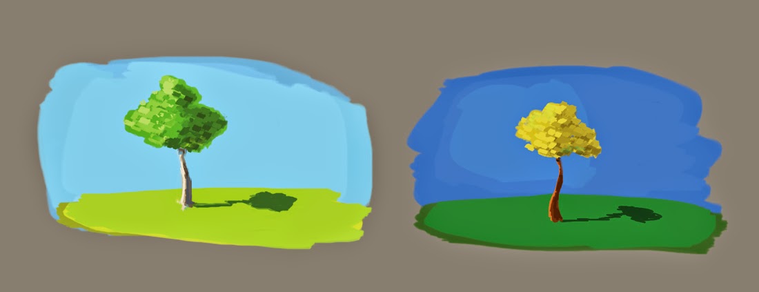
Perspective is off. Trying to understand the notes from before about the color of the shadow and the sky. Hope I'm getting closer.
Monday, November 3, 2014
Costumes
I realized that this wasn't the best ref image for color. It looks like the photo was saturated a bit. I wanted to try the blue sky color again so I changed the colors a bit. I hope it still stands up. I think the shadow sides could have gone darker more saturated. Thanks for the feedback.
Subscribe to:
Comments (Atom)


